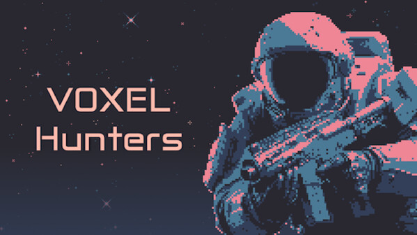
Fight, die, repeat! VOXEL Hunters is a top-down roguelite arena shooter. Enter small, fast-paced arenas where you must eliminate all enemies. Engage in quick, action-packed missions, experiment with powerful abilities and augments, and unlock unique cosmetics to customize your appearance.
Modeled estimate, not a reported figure. How we estimate →
Media

About
The Cosmos Needs Hunters. Are You Up for the Challenge?
An alien scourge ravages the cosmos. You are a HUNTER, the galaxy’s elite defense. Deploy in this top-down roguelite arena shooter and take the fight to the enemy.
Enter small, fast-paced arenas where you must eliminate all enemies. Engage in quick, action-packed missions, experiment with powerful abilities and augments, and unlock unique cosmetics to customize your appearance.
The system’s last hope rests on your trigger finger. Will you rise to the challenge?
Hunt down every enemy in short but challenging encounters.
Experiment with a variety of skills and upgrades to suit your playstyle.
Harvest crystals across diverse planets to unlock permanent upgrades and cosmetics.
Good luck, Hunter.
Stats
All-time low is the lowest price we've recorded for this game since we started tracking it.
Languages: English
Reviews
[h2]I'm sorry but you get a BIG VOXEL NO from me[/h2] This game had it EASY in my eyes. You take the voxel style and slap it onto a sort of reverse bullet hell shooter a la Vampire Survivors. Then shove as much rogue lite/like elements and abilities into it as you can! Do it well and it should be PRINTING you money. Voxel Hunters does not do this well. THIS FULLY RELEASED GAME has so little to show. It's lacking so much style outside of the Voxel Hunters themselves and their Voxel Enemies. There are more details on the SHIP that players might never see than there is in the PLANET MAP. Which is actually just a small Square. See Time Warpers on how to use Voxel in a more interesting and varied way. "Assemble your squad. Calibrate your gear." There is no one to play with in a squad. There is nothing to "Calibrate" for my gear. All these little taglines on the store page are nonsense. [h3]The Menus?[/h3] They're basic and plane. No style or anything Voxel to look at. It's a see through box on top of pixel style of outer space. The game name is in some sort of weird font that gives it a slight style but ultimately is just as bland as everything else. Starting a Session dumps you into what seems like a Planet selection menu with no real knowledge of what to do next or why it looks so barren. You have 2 Planets to choose from and the first one in the center of the screen is Sol Invictus which... Does nothing. Is this a Planet or a Star? It's got heavy "That's no moon!" vibes to it. Your REAL option is to choose the other planet on the left, Aeagrus. Which is a neatly animated pixel planet but is also... not Voxel like the floating Voxel Hunter next to it. After selecting Aeagrus as your planet of NO CHOICE... you're greeted by this new Menu screen which is your everything screen as it's your Hunter Selection, Character Customization, Character Upgrades, Character Info. Weapon Selection, Weapon Customization AND Details (Of which is actually PLANET DETAILS or MISSION BRIEFING) The UPGRADES Menu has a damn SCROLL BAR for it. YOU HAVE SO MUCH SCREEN REAL ESTATE and made all the info as if my monitor is 600x900. Why is everything so HUGE? Why is everything contained in large boxes If it's just a +10%? Look at how Vampire Survivors did the Upgrade menu, it's a Box with an Icon on it, you click it and information is displayed within another area. This method allows you to fit MORE onto the screen at one time. It also limits the need for scroll bars until you have enough upgrades to spend into. OPENING THE PAUSE MENU when playing in SOLO PLAYER MODE does absolutely NOTHING to pause the action. So you can die while trying to adjust volume settings. Things like Character Information and Stats are in either different selectable menus or a weird toggle and they literally just could've been shown on the same screen. Being able to Color your Voxel Hunters and their Weaponry in whatever choice of colors you want is a great addition. However, the way rotating them around is with the Mouse seems to boarder on the insanely annoying as it they can be rotated in any direction or axis with no reset even if you switch characters. I had my Voxel Hunter stuck at a weird angle which made it annoying to color. [h3]The Enemies?[/h3] They either rush head first towards you at insane speeds or attack you from a distance with a Wildstar style grey attack outline. Every enemy from 1 second in to 4+ minutes in are basically the same AI wise. They are constantly winding up for attacks to the point where they overlap each other and with your limited Dodge Rolling, Movement Speed and Fire Rate... you just end up getting hit. Why do they not slowly come into frame and make their way towards the Hunter? Like, seriously, WHY are they so aggressively fast from the get go? Why are they not really animated at all? They have a sort of wiggle or squish effect visually but they don't really do anything other than that for the most part. I honestly can't even tell you if there are Elite enemy types or bosses as everything I've seen besides the Insta-Kill Tremor guy are just more of the same with a different appearance on them. [h3]The UI?[/h3] These are just a series of boxes that either scream PLACEHOLDER or are so Minimalist it hurts. I do not like how the 100/100 sits at the left of the HP Bar instead of the Center. Nor do I like how there is no animation to the bar itself. It doesn't even have shading! It's just a plane red bar. The EXP bar does not show how much XP you need to level, which is fine but... WHY BOTHER HAVING every enemy I kill say +XP on them then? It doesn't even tell me HOW MUCH XP. Is this here because there are no XP ORBS or something like that to pick up? What's the Cooldown time remaining on my Plasma Genade? I dunno, it's slowly filling back to white it doesn't even have a secs timer on the VERY LARGE ICON. And said ICON does not properly represent a GRENADE in the slightest. It looks like a wannabe Blockchain icon. There is no retical of any kind. Not even a Rockstar DOT! There is No PROPER indicator for how many shots I have in or left for my gun. A large Orange bar does not tell me how many before reloading. It, infact looks more like a Stamina Bar for Dodge rolling. If you had a retical you could've place the ammo count within it. The Choose Weapon or Hunter Upgrade screen is so boring and the placement of the options are weird. Why not just do it the standard 1, 2 ,3 instead of have 1 and 2 standing on top of 3 like an upside down 3 block pyramid. Why does the game not tell me to BREAK ROCKS FOR UPGRADE CURRENCY? I literally didn't get anything from killing waves of creatures besides XP. I had to go the the store page and happen to notice the gif towards the bottom. Why is the Mini Map populated with a Black Box which is my "Ship" and a Green Box, which is me... and NOTHING ELSE?! Is this supposed to be useful for Co-op Play? [h3]The Upgrades?[/h3] They're the EXACT bog standard type of ones you'd expect. There is nothing really cool or interesting here. Even the upgrades your select while battling it out on a Planet are the same bog standard X does Y +25% style things. But since all the enemies do the exact same things and there isn't a tiering up mechanic, it's pretty pointless. These Rogue Lite/like options just exist to check the box not to make for interesting gameplay. If I had to rate this game... I'd give it a 2/10 and it's entirely because I like the Voxel Visuals. I'd love it if the dev could continuing making some improvements to actually flesh out the game they expect people to pay for. Until then, [b]The Cosmos Needs Hunters; but there is are challengers[/b]
Challenging, fun, and with a satisfying upgrade progression that keeps me coming back. VOXEL Hunters has a similar appeal to Vampire Survivors, though the gameplay here is more hands-on, with dodging enemy patterns and a combat roll ability. It’s not as flashy or packed with dopamine-inducing animations, but I’ve found I don’t really need those to get hooked!
Related
Related
Trends
Modeled estimate over time, reconstructed from Steam's monthly review histogram.
Momentum
Pace estimated from the game's recent review growth (our daily snapshots) at its own sales-per-review ratio — a momentum signal, not booked sales.
Related
| Glasses and Girls | $316 | 51 | 82% | $0.99 |
| Bongo Quest | $322 | 52 | 46% | $4.99 |
| Dances and Girls | $322 | 52 | 83% | $0.99 |
| Cosmic Journey PC Live Wallpaper | $336 | 52 | 71% | $0.99 |
| Forest and Girls | $340 | 55 | 82% | $0.99 |
| Work And Girls | $347 | 56 | 86% | $0.99 |
Related
| No Man's Sky | $636.2M | 412.8K | 85% | $59.99 |
| 7 Days to Die | $425.3M | 398.5K | 87% | $44.99 |
| Palworld | $415M | 463.2K | 94% | $29.99 |
| Mount & Blade II: Bannerlord | $309.8M | 294.6K | 88% | $49.99 |
| The Forest | $254.8M | 679.3K | 96% | $19.99 |
| Ready or Not | $238.1M | 340.1K | 78% | $49.99 |